Hubber
Intro
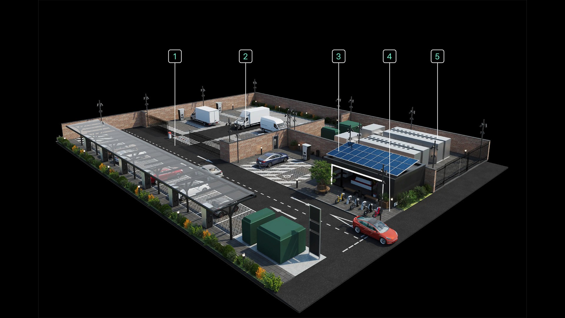
Hubber is a real estate platform founded by a former Tesla team, built around transforming underutilised urban properties into ultra-rapid EV charging and integrated energy hubs. They came to us to build the brands identity from scratch and carry it through to their website and initial brand assets.
Branding
Website Design
UX/UI Design
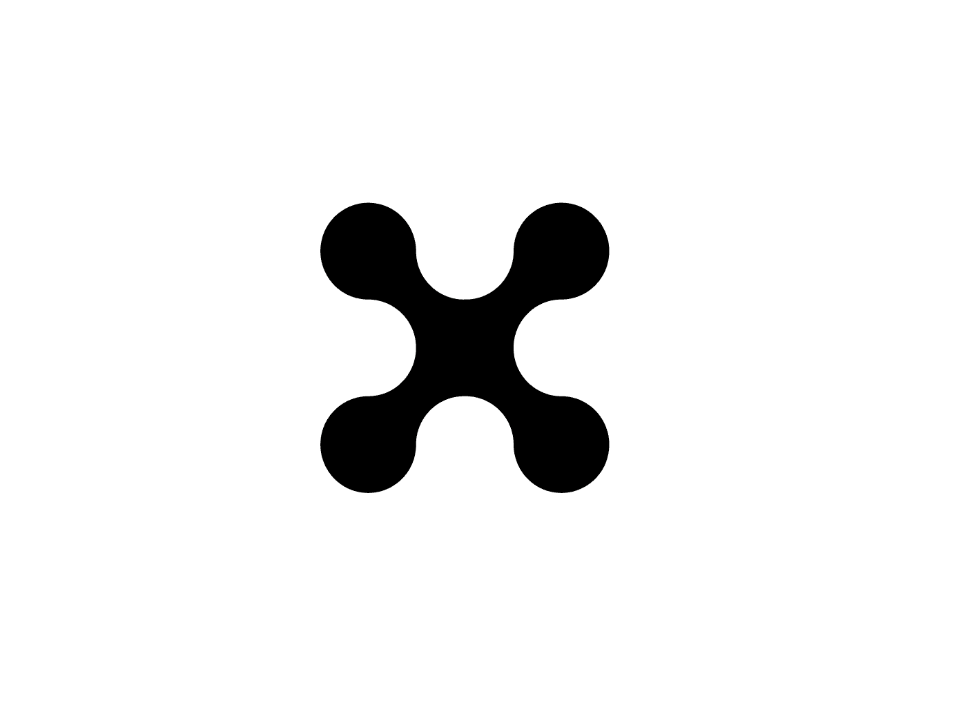
Logo Design
Year
/
2025
Client
/
Hubber
DISCOVERY We started by grounding ourselves in the world Hubber operates in: urban infrastructure, energy networks, and the rapidly evolving EV landscape. Before any creative work began, we ran a structured discovery phase - holding stakeholder sessions to understand the business objectives, target audiences, and long-term brand ambitions. These conversations were critical in aligning on direction early, ensuring the brand strategy reflected not just where Hubber is today, but where it's heading.
STRATEGY Alongside this, we conducted a thorough competitor analysis, mapping the visual and tonal landscape across EV charging, urban tech, and energy infrastructure. What emerged was a clear gap, most players in the space leaned either too corporate and utility-heavy, or too consumer-friendly and unsubstantiated. Hubber had an opportunity to occupy the space between: technically credible, but with a clarity and confidence that didn't require an engineering background to appreciate. We synthesised these findings into a brand strategy that defined Hubber's positioning and visual direction, a foundation their brand could build from.
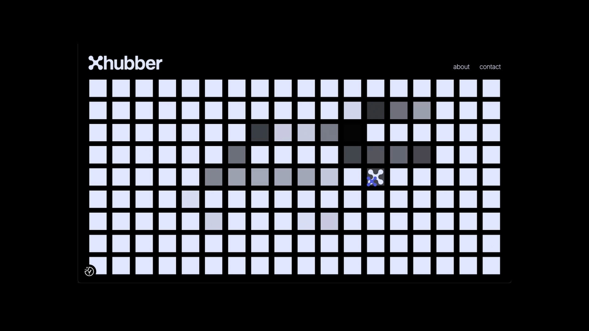

CREATION With the strategy agreed, we moved into the creative phase. The grid became our core design tool, drawing on electrical gridlines, city layouts, and the geometry of current flow. Working through a series of typographic and graphical explorations, we developed a bold, versatile company icon, one that works at favicon scale and holds up equally well across signage and environmental applications.
ROLL OUT & DELIVERY We then rolled the branding out to Hubber's website, designed to communicate the opportunity clearly and confidently to early-stage backers. We explored how the brand's graphical language could come alive digitally - the grid and line system lent itself naturally to interaction, with animated squares responding to hover states and a sense of current flowing through the layout as you scroll. The result was a digital presence that didn't just reflect the brand, but extended it.
